Let’s imagine that you have got hold of one of my models, and think you can improve it. Maybe you decide to add a couple of stocks and flows, change an equation or two, adjust some of the parameter values, and edit the labels for some of the variables. Great: I’m quite prepared to believe that your model is an improvement. But: I would like to know what changes you have made.
Wouldn’t it be good if we could do that automatically? – get a report of the things you have added, removed or changed? The Systo widget compare_models_text does just that. As the name suggests, it produces a text report of the differences between two models, where one is derived from the other.
It is best understood by looking at the following two diagrams, which show two versions of a simple model (Miniworld).
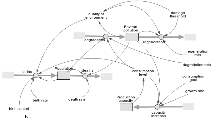

The red circle shows where something has been removed; the green circle, where something has been added; and the red and green dots illustrate the change in node label.
Now let’s look at the report produced by the compare_models_text widget.

Pale red indicates a removal; pale green indicates an addition. You can see that 2 nodes have been added: the stock “Extra stock” and the valve “extra flow”. One node has been removed: the variable “birth_control”. One label has been changed. We can also see that the equation for the “births” valve has been changed (something not shown on the diagram).
For space reasons, I have not shown a similar report on the changes to the arrows: the loss of the influence arrow from “birth_control”, and the gain of the flow arrow into “Extra stock”.
Often you want to see just the changes, and a simple option setting allows you to suppress all identical rows (i.e. nodes and arrows which are the same in both models).
Clearly, it would be good to complement this text report with a corresponding diagram, similar to the hand-crafted one above. I have ideas about how to do this, but have not yet started to implement it.
Note that this widget uses the internal IDs of the nodes and arrows (not their labels) to decide on which elements are the same in the two models. So, it can work only where one model really is derived from another. It would not work if the second model is re-implemented from scratch, even if you tried to copy the first, since there is no guarantee that all the elements will be added in the same order. Determining similarity and differences between two independently-produced models (using, perhaps, the labels, equations and general topology of the model) is a much harder problem, and probably impossible to come up with a prefect solution that works in all situations.

